We've recently updated our Terms of Service and Privacy Policy.
Small business website design is essential for companies looking to build a strong online presence and convert visitors into customers. A well-designed website doesn’t just look good, it tacitly communicates professionalism, builds trust, enhances usability, and supports business growth. For small businesses, strong website design can be a major competitive advantage, leveling the playing field with larger brands. In this article, you’ll learn 15–20 practical design tips that improve layout, navigation, mobile friendliness, typography, color psychology, conversions, and overall user experience.
Your website influences how potential customers perceive your business from the moment they land on your site. Studies consistently show that users form an impression in seconds. A clean, well-structured design ensures that that impression is positive..
Strong design also improves functionality and performance. Page speed, layout clarity, and mobile responsiveness impact search rankings and conversion rates. Many issues small businesses experience online stem from easily avoidable errors outlined in Common Website Mistakes Small Businesses Make.
The following tips will help you avoid those pitfalls and create a website that supports your brand, engages your users, and drives measurable results.
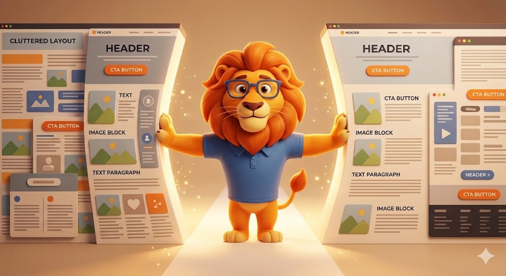
A clean layout is the foundation of an effective website. Cluttered pages overwhelm users and distract from the actions you want them to take, leading to less conversions and a higher bounce rate.
A structured layout makes it easier for visitors to scan content and find what they need without frustration.
Navigation is one of the most important usability elements. Visitors should immediately understand where to go and how to find information.
Easy navigation reduces bounce rates and contributes to a smoother user experience.
More than half of all website visits come from mobile devices. Designing for mobile first ensures your most important content and features are visible regardless of screen size.
Performance is especially important on mobile, making it worth reviewing the guidance in How to Improve Website Performance.

Color influences emotion, perception, and behavior. Your brand colors should feel intentional and consistent with the impression you want to make.
A consistent color palette strengthens brand recognition.
Typography affects both readability and brand personality. Selecting the right fonts helps establish authority and improve the user experience.
White space is an essential design tool. It improves readability, highlights key content, and reduces cognitive load.
White space is not simply wasted space, it is a strong design asset when used correctly.
Calls-to-action guide visitors toward the next step, whatever that may be: contacting you, scheduling a consultation, buying a product, or downloading information.
Strong CTA strategy aligns closely with the writing principles in How to Write Good Copy for Websites.
A slow site frustrates visitors and damages credibility. Speed is also a strong ranking factor for Google.
For a deeper technical breakdown, review How to Improve Website Performance.
Visuals should support your message, not distract from it. Low-quality images hurt trust and create a poor impression.
High-quality visuals strengthen your credibility and help build trust with visitors.
A website should guide users toward conversion — whether that’s booking a service, purchasing a product, or requesting a quote.
Conversion design reduces friction and improves results.
Customers trust businesses that other customers trust. Displaying reviews prominently reinforces your reputation and enhances credibility.
Social proof is also a key trust-building element in What Makes a Website Trustworthy.
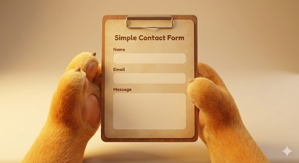
Forms are often the final step before conversion. Simplifying them increases the likelihood that users will contact you.
Reducing friction improves form submissions significantly.
Your design and your copy work together to create a cohesive experience. Clear messaging ensures visitors understand what you do and why it matters.
This aligns with the strategies described in How to Write Good Copy for Websites.
Design sets the stage, but messaging drives action.
Consistency builds recognition, trust, and professionalism. Inconsistent colors, mismatched fonts, or outdated visuals reduce credibility.
Consistent design supports a cohesive brand experience.
Visual hierarchy helps guide users through content, making your pages easier to scan.
Hierarchy ensures users understand what’s most important at a glance.
Many small businesses unintentionally weaken their online presence with preventable errors, many of which align with those found in Common Website Mistakes Small Businesses Make.
Fixing these issues immediately improves user experience and conversions.
Effective website design is about more than visual appeal. It’s about clarity, usability, trust, and guiding visitors toward meaningful action. When you focus on clean layouts, structured navigation, readable typography, strong messaging, and high-quality visuals, your website becomes an asset that supports your business and strengthens your brand.
With the right strategy and consistent improvements over time, your small business website can attract the right customers, build credibility, and drive long-term growth.
We’ll give you a call to set up time for your team and ours to meet virtually for a personalized demo.
Book a Demo


.png)
%20(1).png)
.svg)
.svg)


.png)