




Primary blues
Blue projects a sense of calm, trustworthiness, and safety upon which, we can build happiness.
Light blue
- Hex
- #00D1FF
- RGB
- 0, 209, 255
- CMYK
- 62, 0, 0, 0
- PMS
- 3545C
Dark blue
- Hex
- #015BFF
- RGB
- 0, 91, 255
- CMYK
- 82, 65, 0, 0
- PMS
- 285C
Brand
Our logos and colors, and how to use them. Download the official logo files below.
Great brands are easy to recognize. Whether someone sees Levitate in an email, on a website or in a news story, it should look and feel like us.
The Levitate name and logo belong to Real Magic, d/b/a Levitate. This page is here to help partners, customers, press and anyone else who features Levitate in their own work use our name and logo the right way, with our official logo files, how to use them and our primary colors.
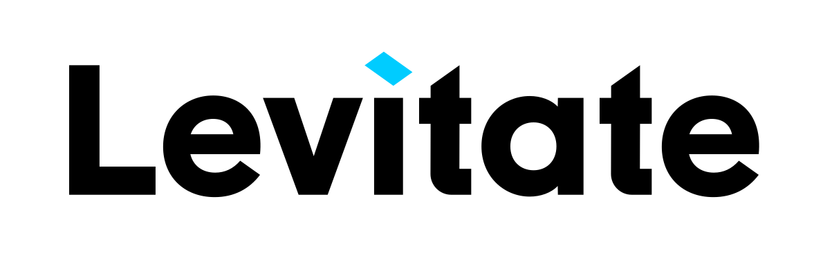
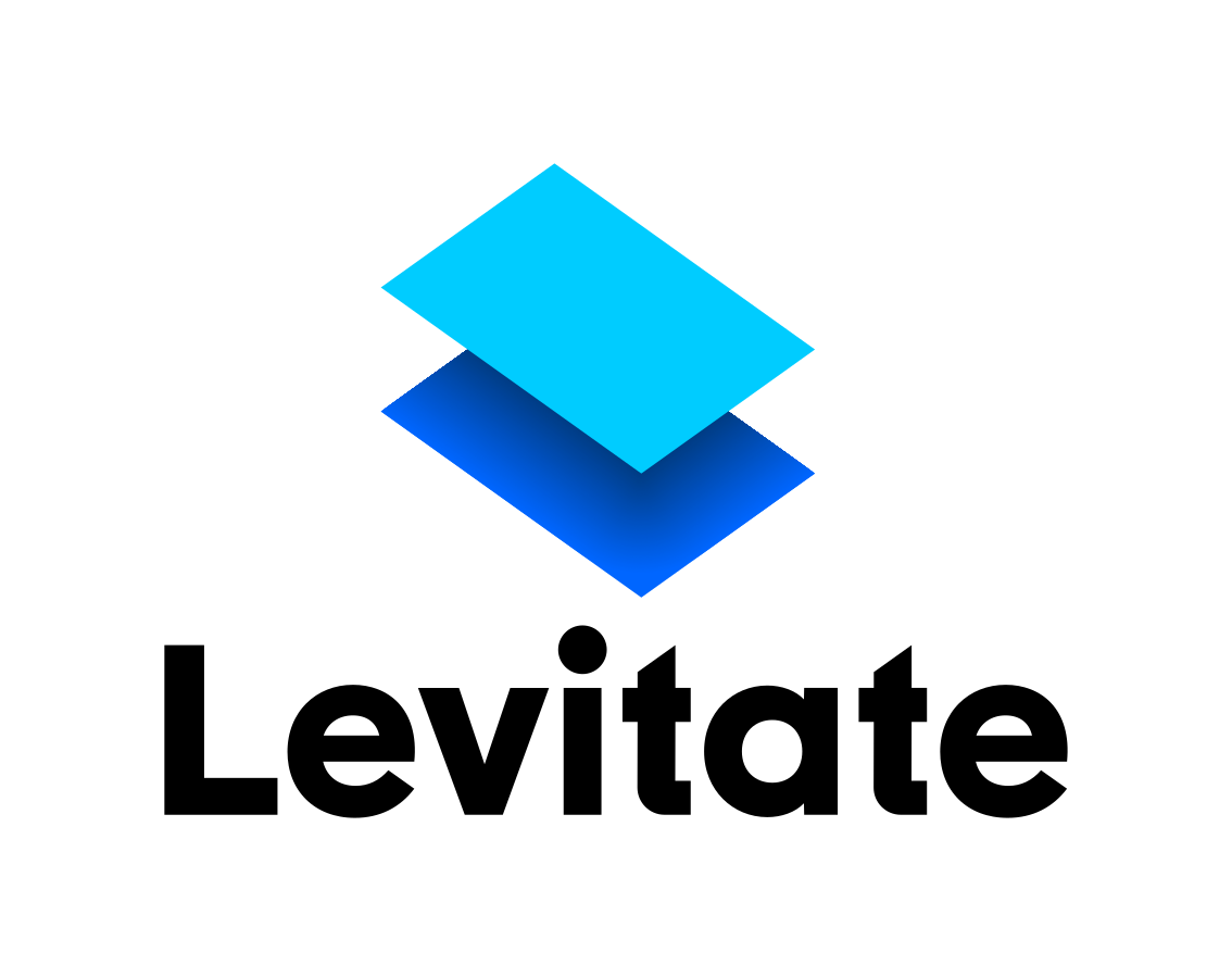
The Levitate logo is made up of two main elements: the “Mark” and the “Type”.
The logo mark is usually placed to the left of the logo type, but may also be placed above the type depending on the needs of your layout (see Variations below).
The Levitate Logo Mark is designed to be a symbolic representation of the word “Levitate.”
The mark consists of a light blue, 2 x 3 plane in an isometric space rotated 45 degrees to the viewer. The plane is casting a dark blue shadow over an invisible floor.
The shadow contains a subtle gradient which gives the mark depth. This gradient is removed when the logo is used at small sizes.
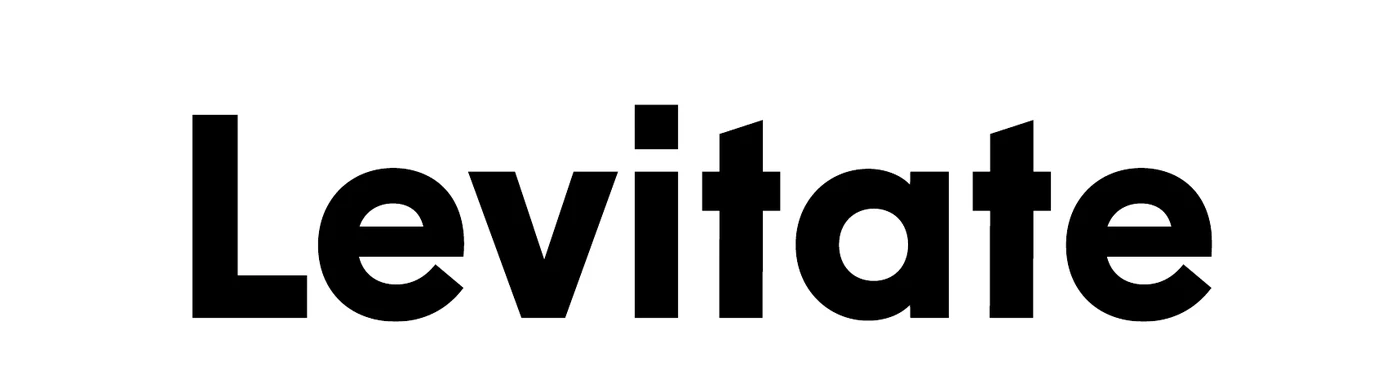
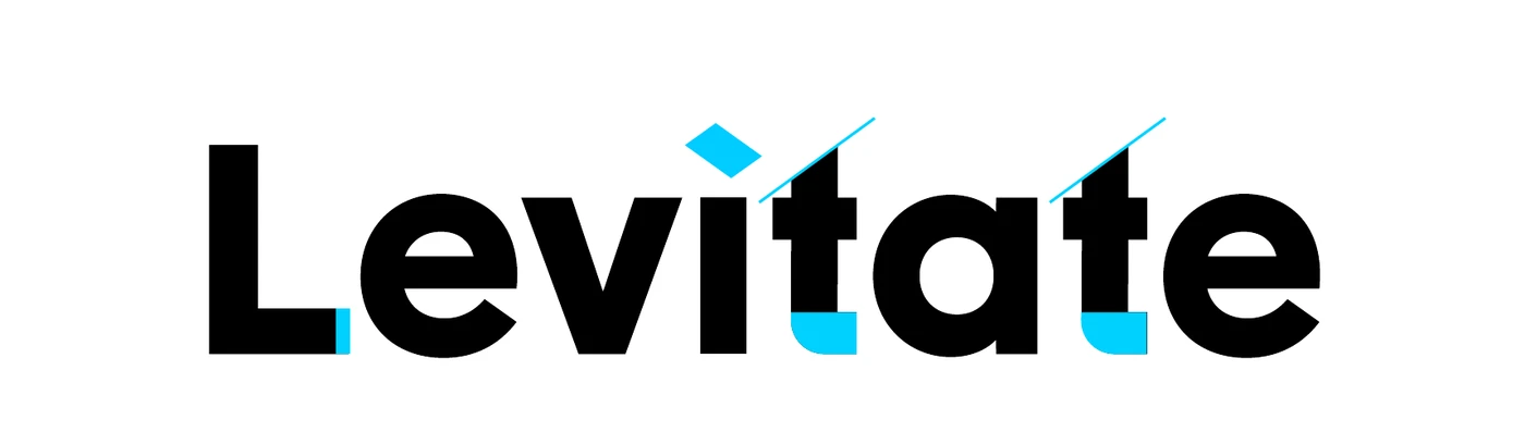
The logo type is designed for a clean, friendly look. For this reason, we started with a bold, sans-serif typeface with some personality called New Order.
To further align the type with the brand, the following modifications were made:
There are three main variations of the logo:
Each variation has a corresponding “small size” version that removes the gradient in the mark and the “confetti” in the type. These should be used when the logo is 200px wide or smaller. For example, you might use one of these variations for a social media profile picture.
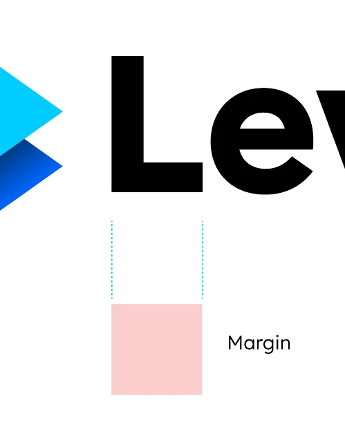
It’s important to give our logo enough space to stand out. Never crowd the logo.
But how much space should you give it? A convenient unit of measure is built right in: use the width of the letter “L” as your margin.
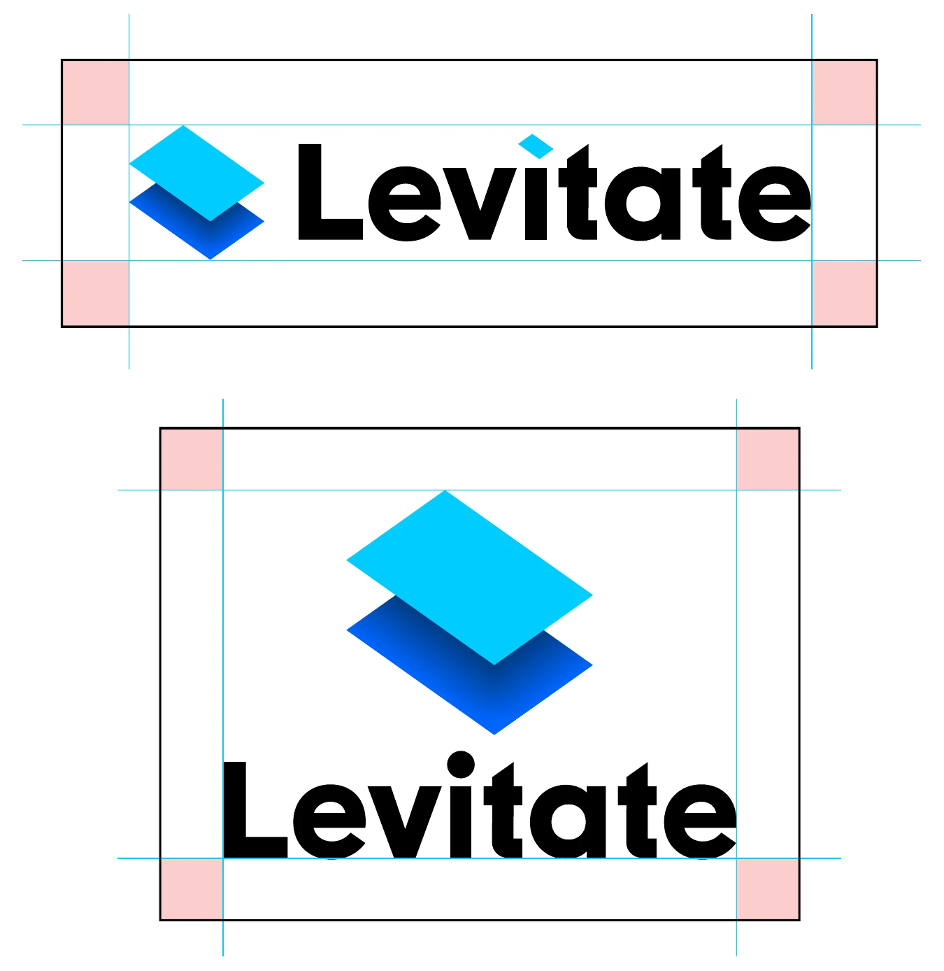
Repeated, consistent application is key to a logo’s success. For this reason, it’s important not to modify the logo in any way.
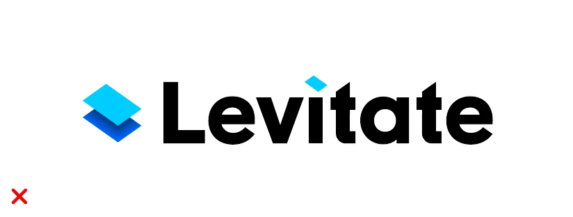
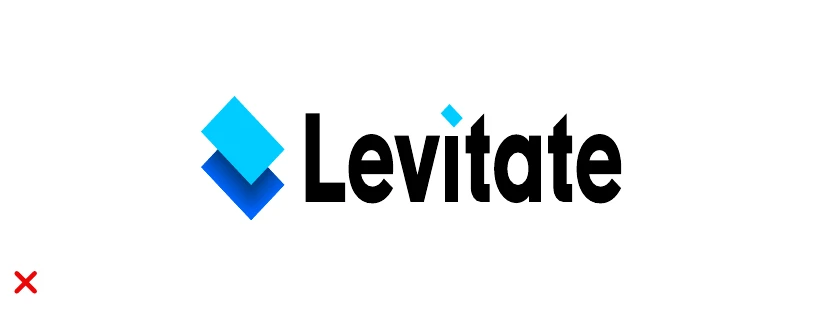
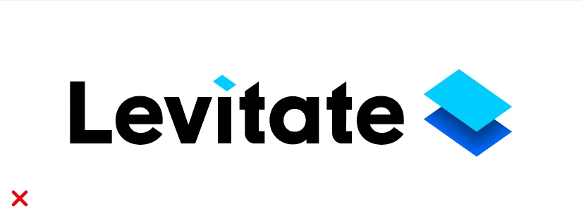
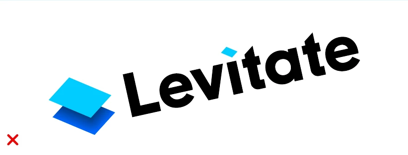
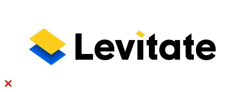
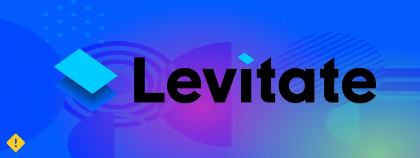
Whether you’re a partner, a customer or a member of the press, here’s how to show our logo the right way.
Do:
Don’t:
Each logo comes as an SVG, for print and anywhere it needs to scale, and a PNG. Use the white text and white plane versions on dark backgrounds.
Blue projects a sense of calm, trustworthiness, and safety upon which, we can build happiness.
Light blue
Dark blue